About the Company
Agilence is a leader in retail, restaurant, grocery, convenience store, and pharmacy data analytics.
Their platform uses machine learning and advanced reporting to help enterprise teams detect anomalies, identify trends, and improve operational performance.
With Agilence, organizations gain real-time visibility into their business so they can make faster, more informed decisions.
Background and Challenge
Agilence came to us with a website that no longer matched the quality of their product or the pace of their marketing team.
They faced several challenges, including:
-
Hard to edit pages that required developer help and slowed campaign launches
-
An outdated design that did not reflect their modern and data driven technology
-
A growing resource library that was difficult to manage and lacked filtering or easy browsing
For a scaling SaaS company, these issues were more than minor inconveniences. They prevented the marketing team from launching campaigns efficiently and supporting lead generation.
Our Approach
We partnered with Agilence to rebuild the website on a flexible HubSpot theme designed for their marketing team.
The goal was to create a modern digital experience, reduce friction for their team, and improve the way visitors navigate their content.
Before Pixl Labs, it took a tremendous amount of time to make on-page edits to website pages, and sometimes we couldn't make changes at all
Dominick Mauro
Director of Demand Generation
1. Custom HubSpot Theme and Page Builder Experience
We designed and developed a fully custom HubSpot theme aligned with Agilence's brand system.
Every module, layout, and global setting was created for ease of use so the marketing team could launch landing pages and campaigns without waiting on development support.
2. Resource Center Powered by HubDB
To fix the issues with their resource library, we built a HubDB solution that allows the team to add, edit, or remove resources from a single location.
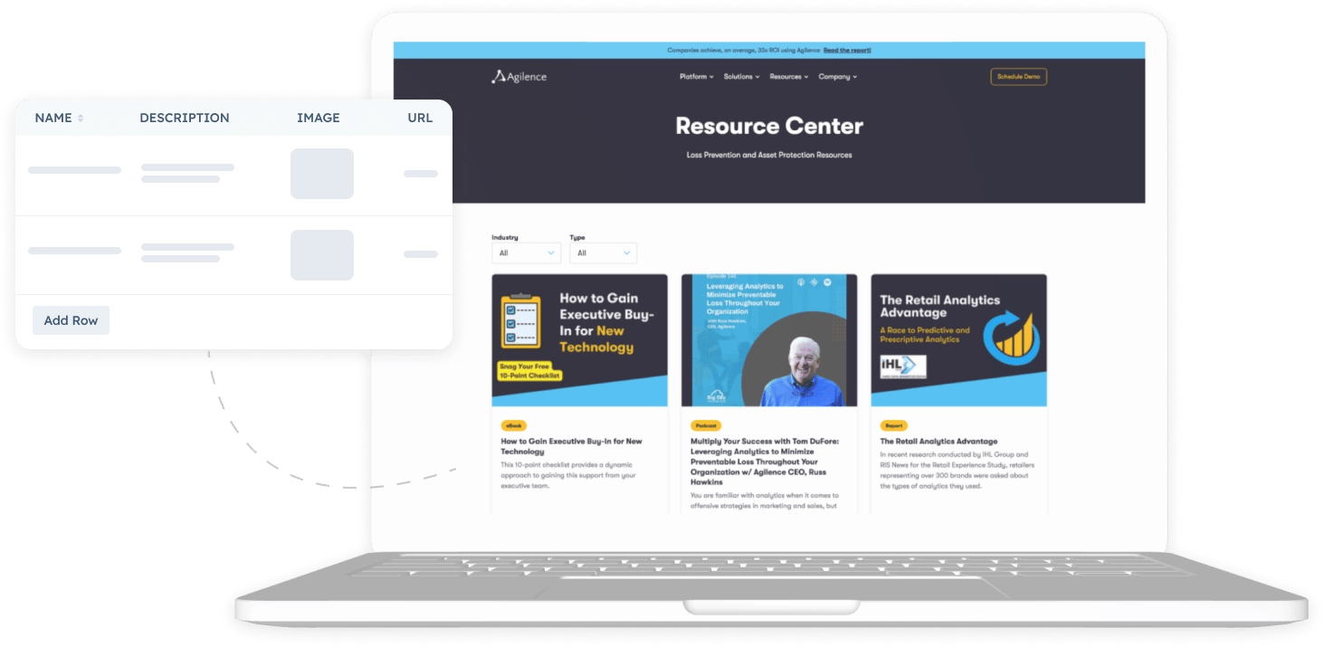
Key improvements:
-
Content that is easier for marketers to manage
-
Filtering tools that help users find resources faster
-
Infinite loading for better performance
-
A clean layout that improves the browsing experience
This system gave Agilence a scalable content hub built for long term growth.
3. Custom Mega Menu for a Better User Journey
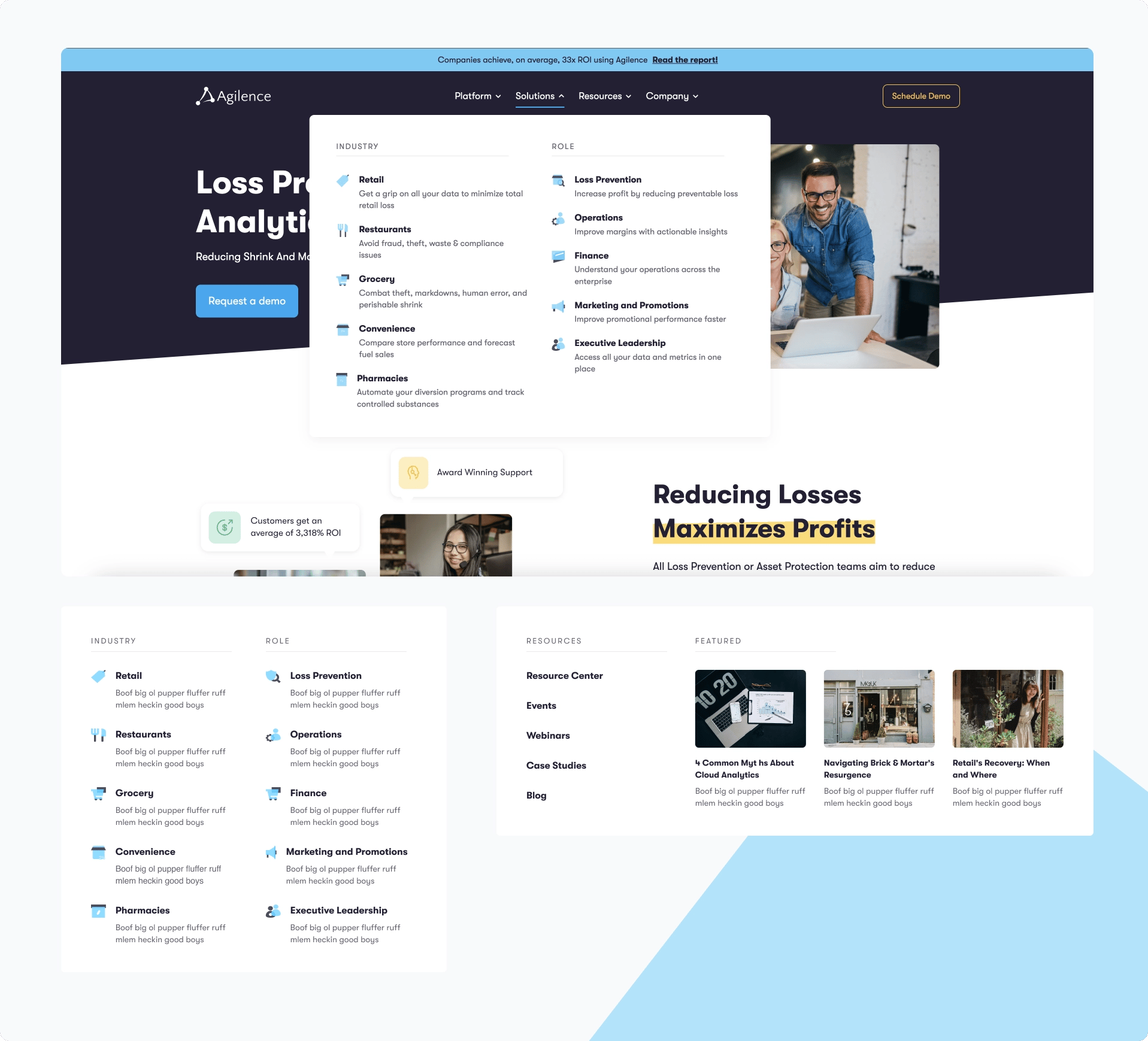
Navigation was a significant pain point, so we created a lightweight mega menu that makes complex information easier to explore.
The menu includes four clear sections: Solutions, Platform, Company, and Resources. The labeling and visual cues help users understand where they are and where to go next, creating a smoother journey across the site.
4. Custom Graphics, UI elements, and animations
To support a more modern brand presence, we created a library of custom visuals, icons, and graphics for use across the site and social channels.
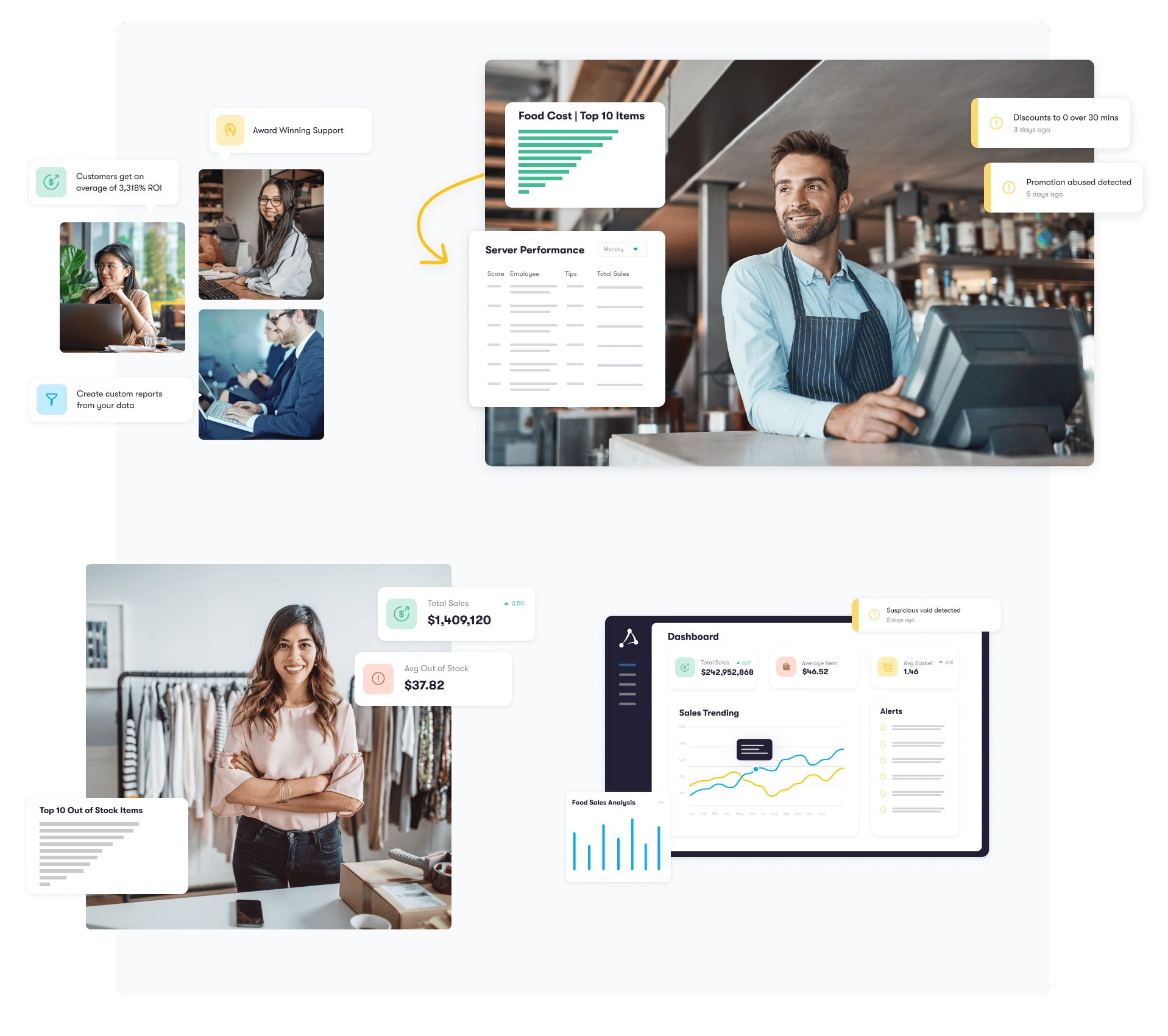
The new visual system provides consistency and elevates the overall look and feel.
We also added motion and scroll based animations to guide users and highlight important content without impacting performance.
Results
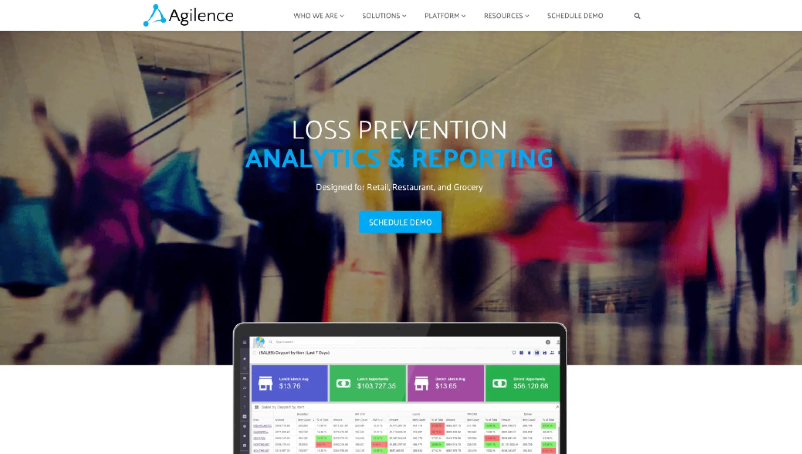
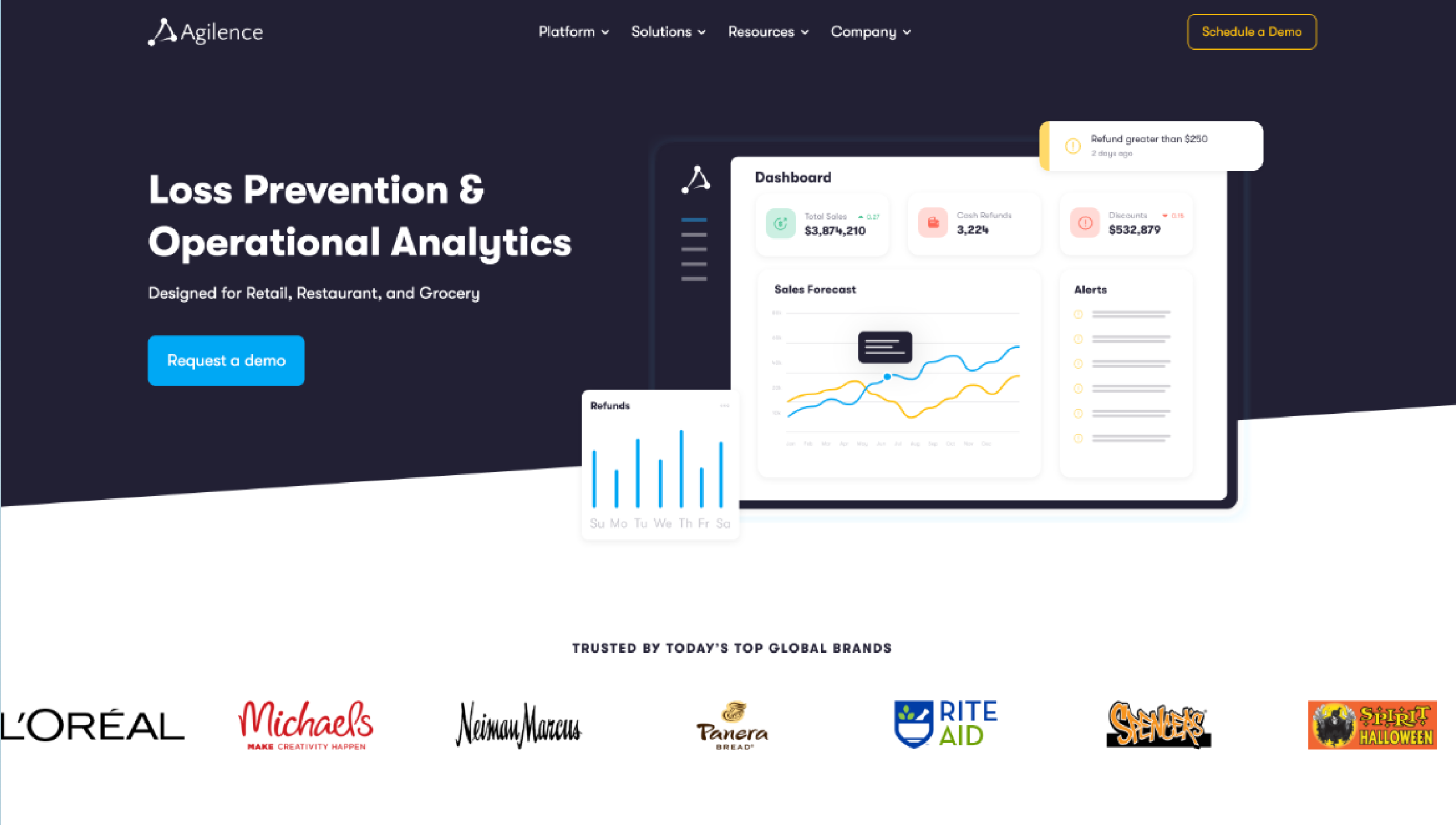
Before
After
The new Agilence website created a better first impression for customers and a far smoother editing experience for the internal team.
After launch, Agilence benefited from:
-
A fully editable HubSpot environment that removed marketing bottlenecks
-
A resource center that is easier to manage and more helpful for users
-
Clearer navigation and a more intuitive user experience
-
Faster load times from optimized modules and lazy loading
-
A modern, brand aligned digital presence that matches their enterprise product
The final result is a scalable and modern HubSpot website that supports Agilence's continued growth.


