

Are you thinking of building a website for your SaaS business?
Studies show that from 2019 to 2023, the global SaaS market is predicted to be worth $60.36 billion, registering a 9% CAGR within the 4-year period. So, a business around SaaS offerings isn’t going anywhere any time soon.
Meaning, more people will come into the market, and you’d need to do something extra to stand out. And in terms of marketing, this starts with your website. It has to be able to get your offering out quickly.
That said, here are 15 examples of great SaaS websites and what you can learn from them:
1. Orbiter
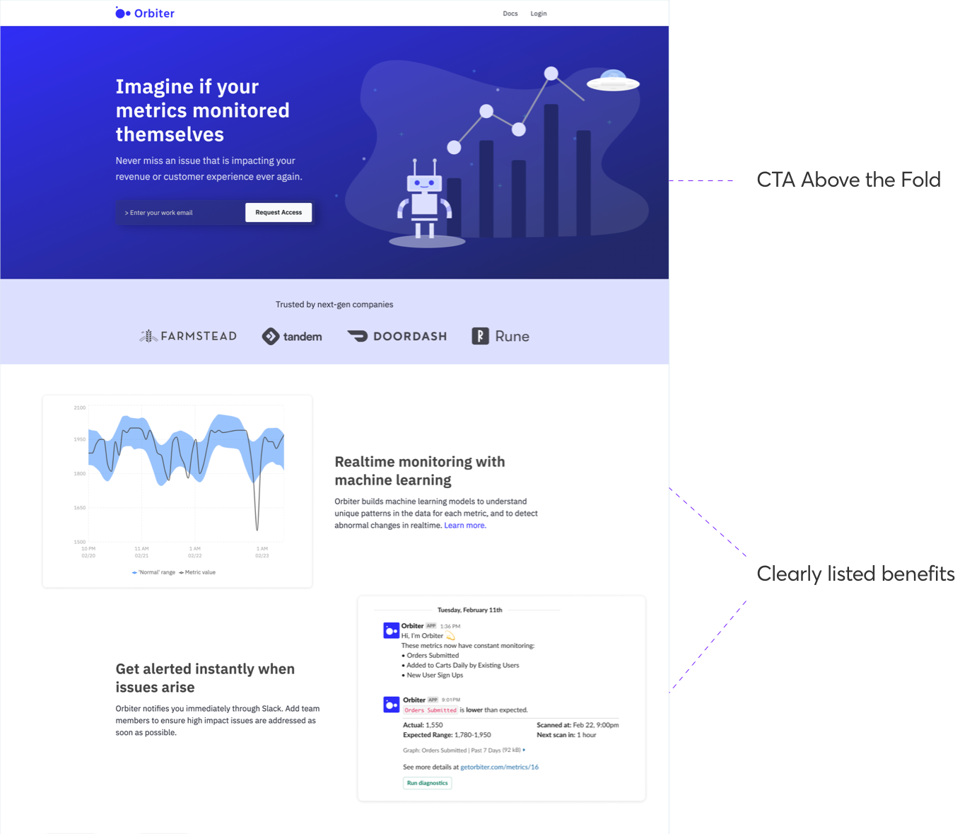
Orbiter’s service is for product teams. Their machine learning tool helps you monitor data and track changes in real-time. So why is their website so great?
2. Streak
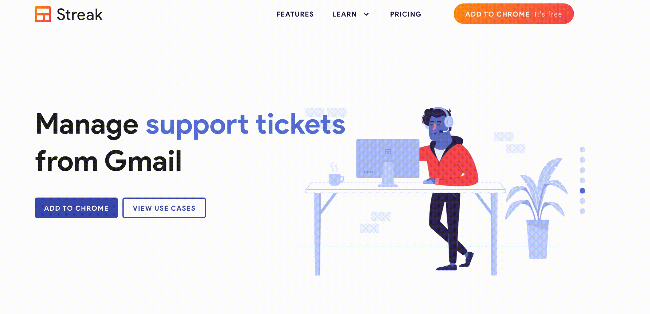
The visually appealing Streak’s website stands out because of the graphical elements and concise copy. They are a SaaS company whose CRM product helps to simplify the work process.
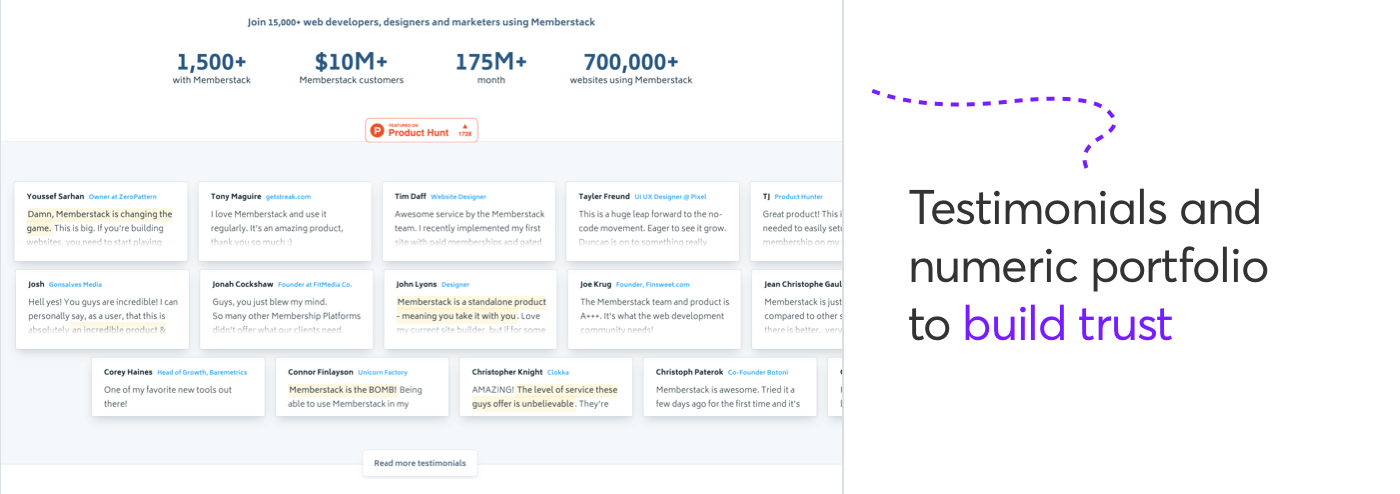
3. Memberstack
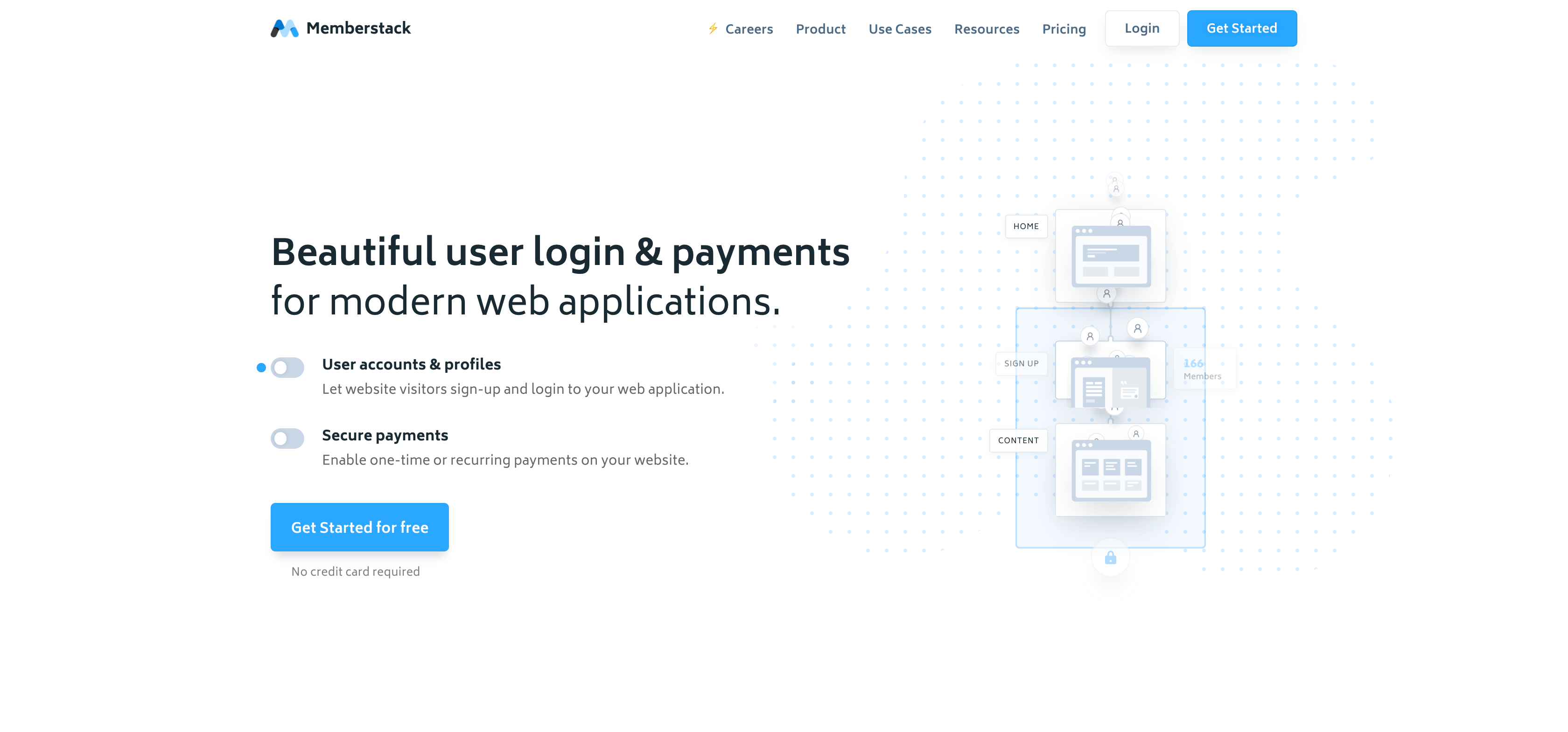
Memberstack is a SaaS company whose service revolves around integrating payment and letting users sign-up/login to your websites.
4. Slidebean
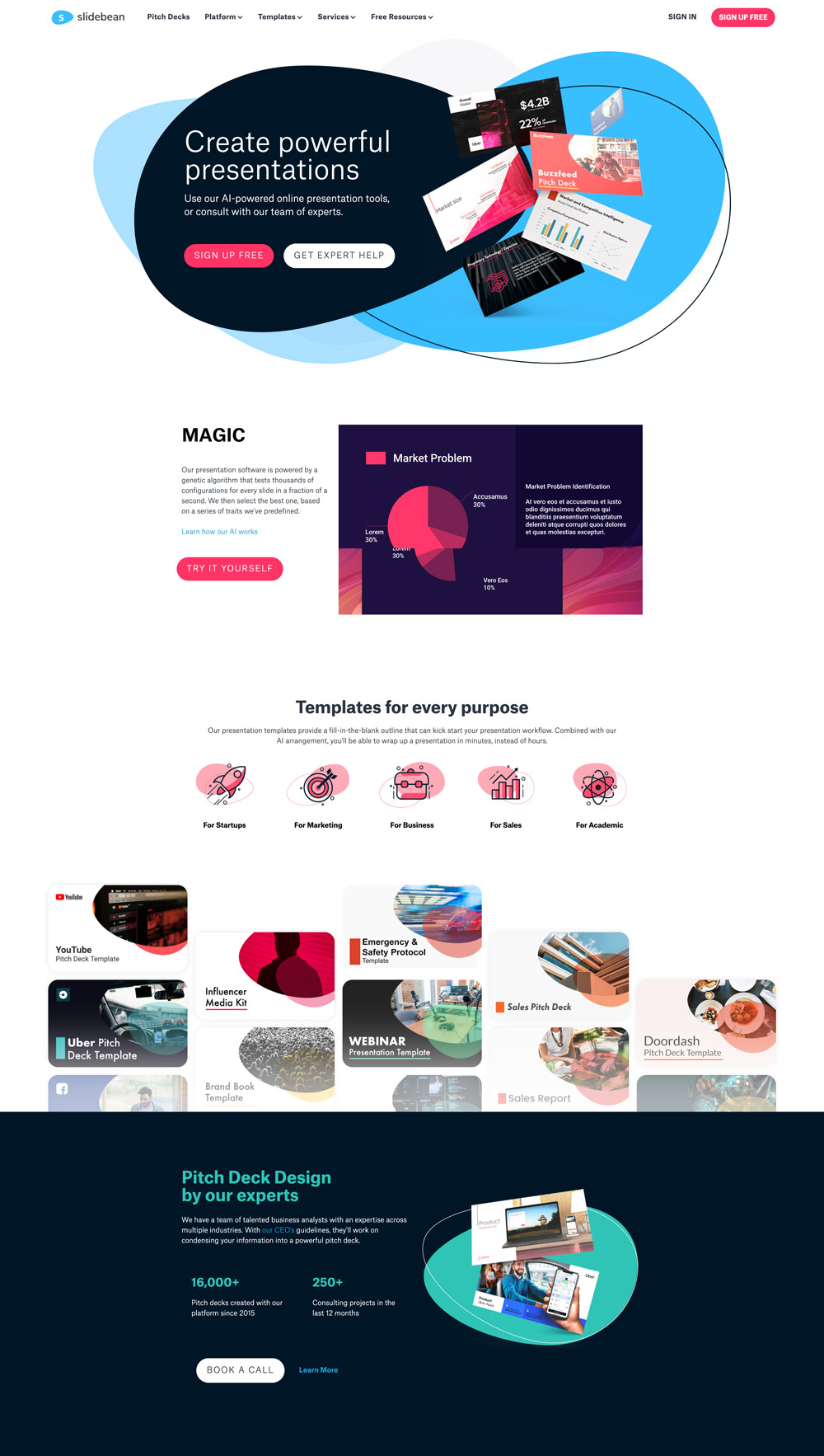
Slidebean helps you with AI-powered presentation templates for various purposes, including startup, business, sales, marketing, academic, etc.
5. Play
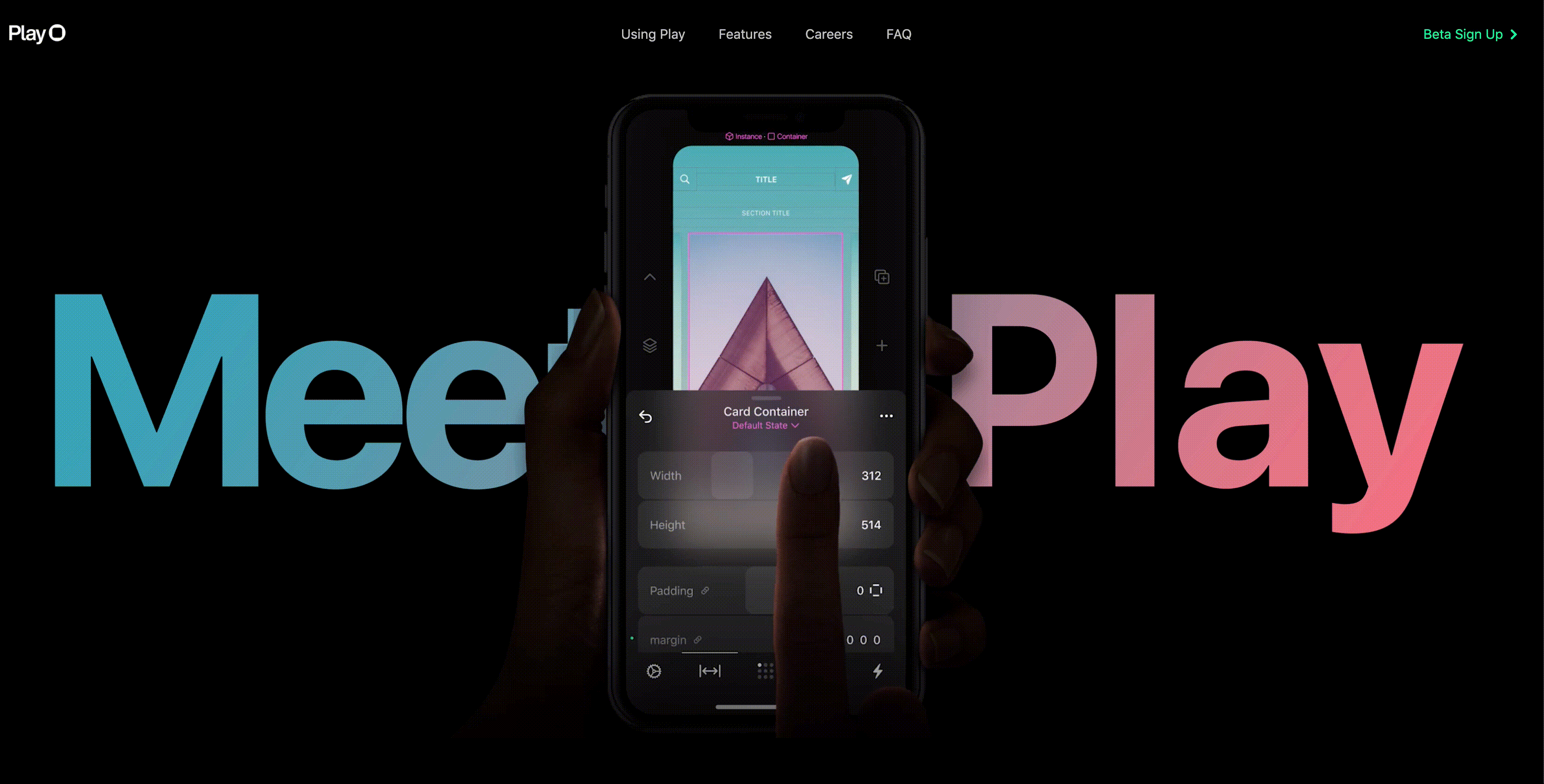
Play’s animated and futuristic-looking website contributes to its quality.
They offer a product design tool that helps you design, iterate, and experiment with your product as you create it.
6. Grow
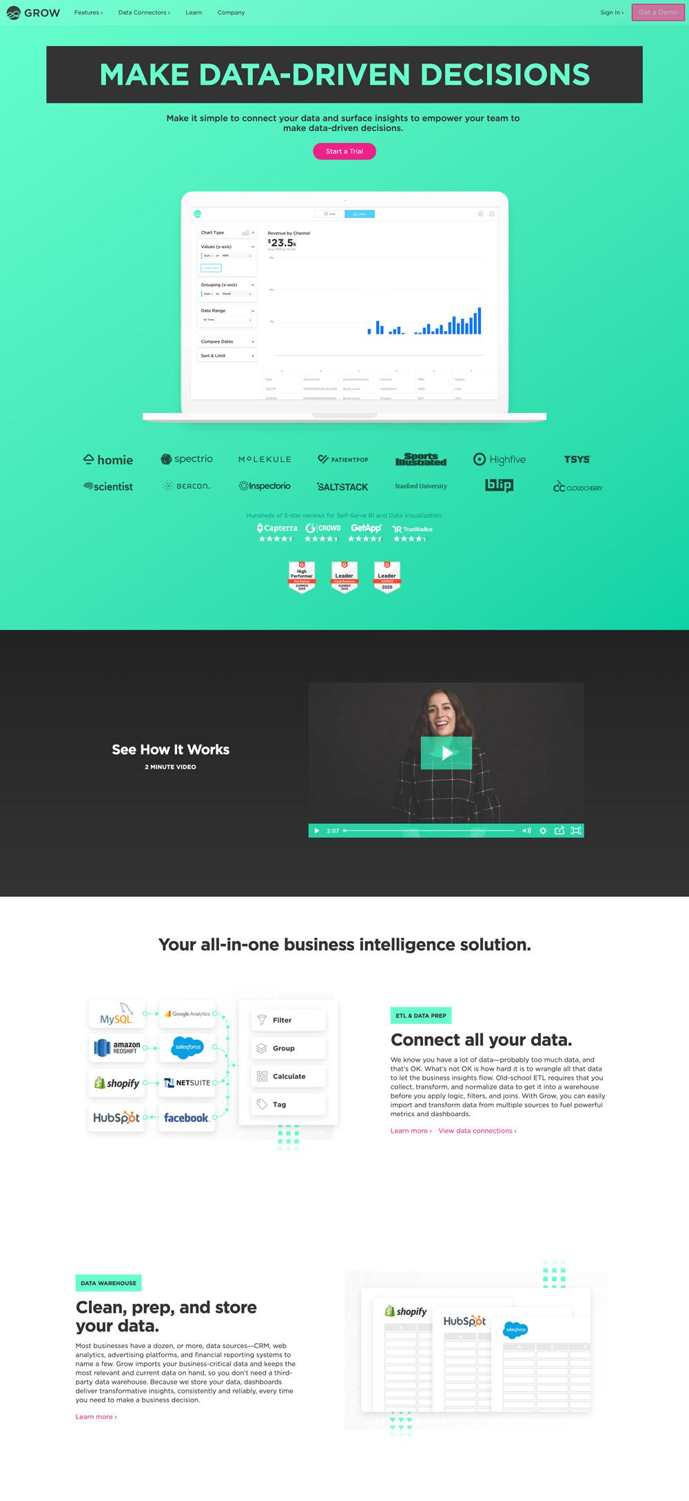
Grow helps you find your data quickly. Their website is very appealing because of their branding and color choices.
7. Draftbit
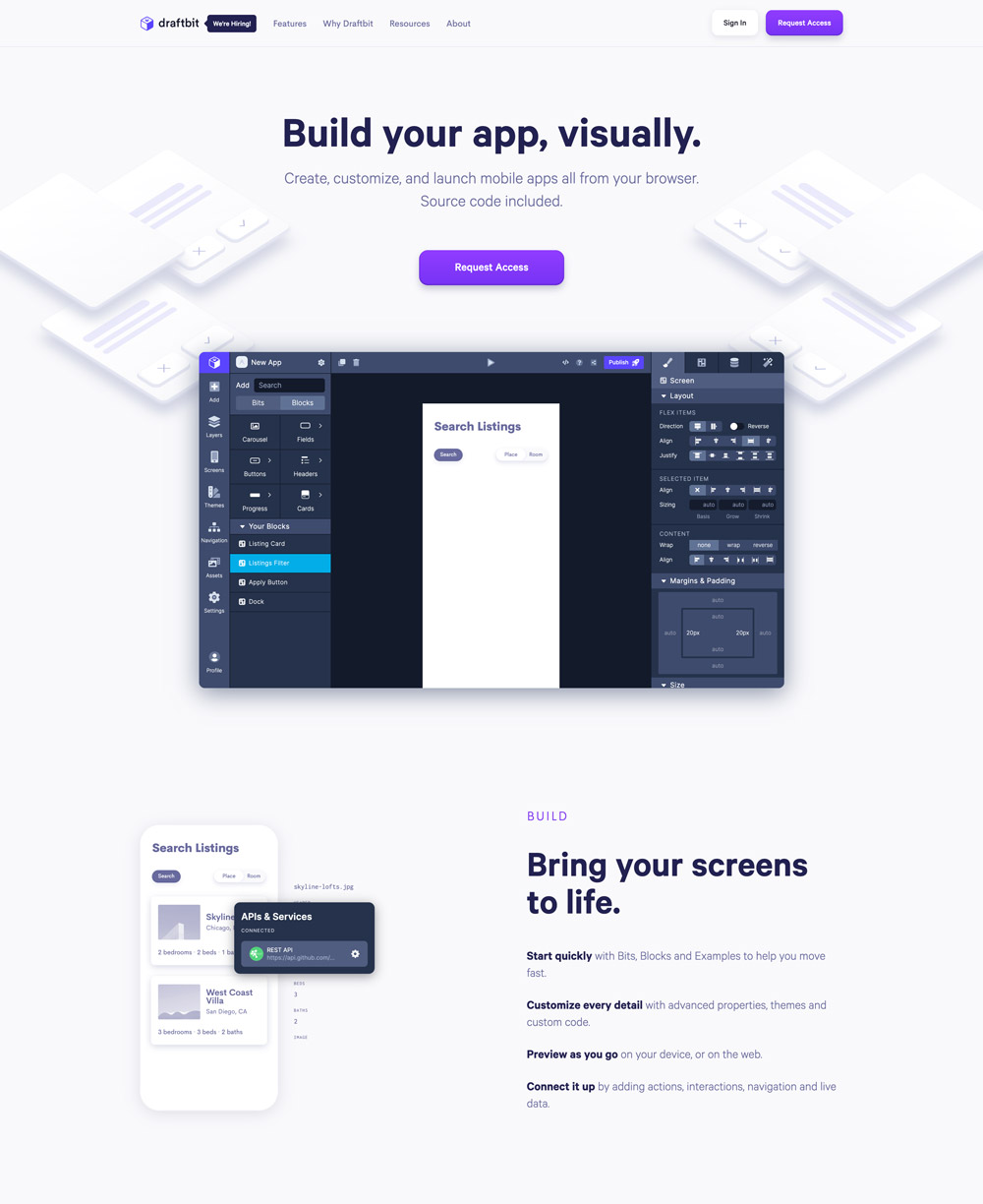
Draftbit’s product helps you build, customize, and launch mobile apps. This is another website that has all the trappings of a compelling website.
8. Fast
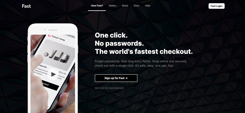
Fast offers a fast e-commerce checkout experience. Their simplistic design is one of their main distinguishing factors.
9. Kraftful
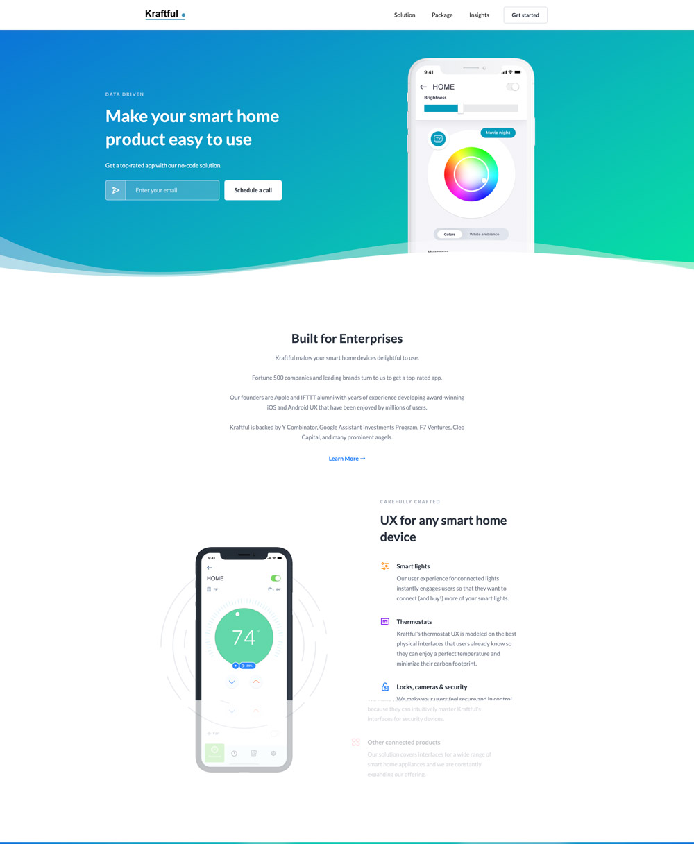

Kraftful’s website is another minimalist website that communicates its message faster. Their service revolves around making your smart home products easy to use.
10. Lorem
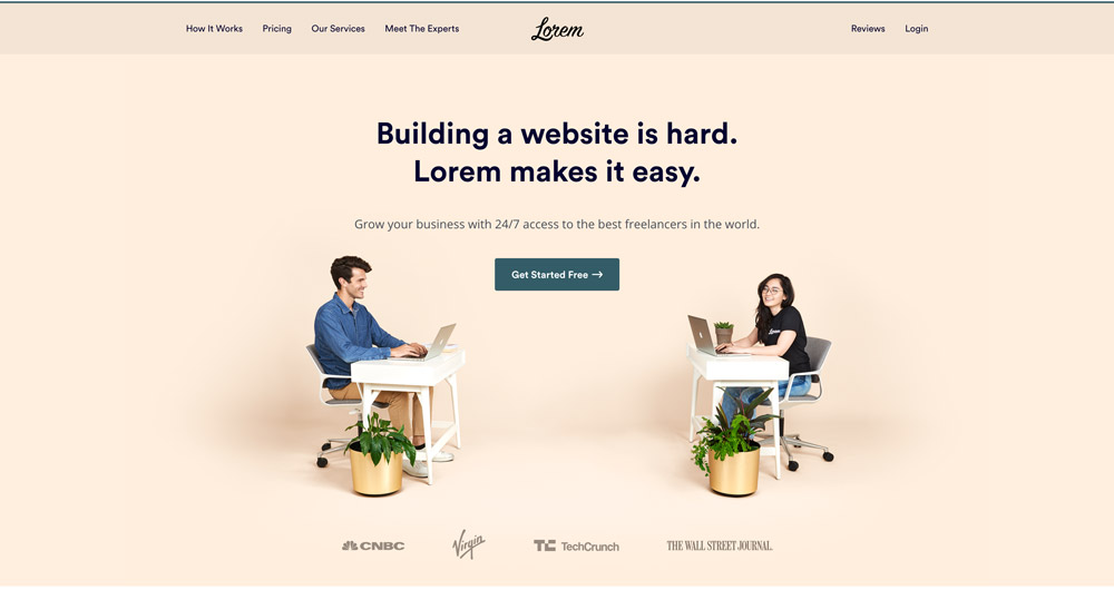

Lorem is a marketplace for freelancers. Their website has this warm and welcoming feel about it, which is a great way to keep people on their page longer.
11. JotForm
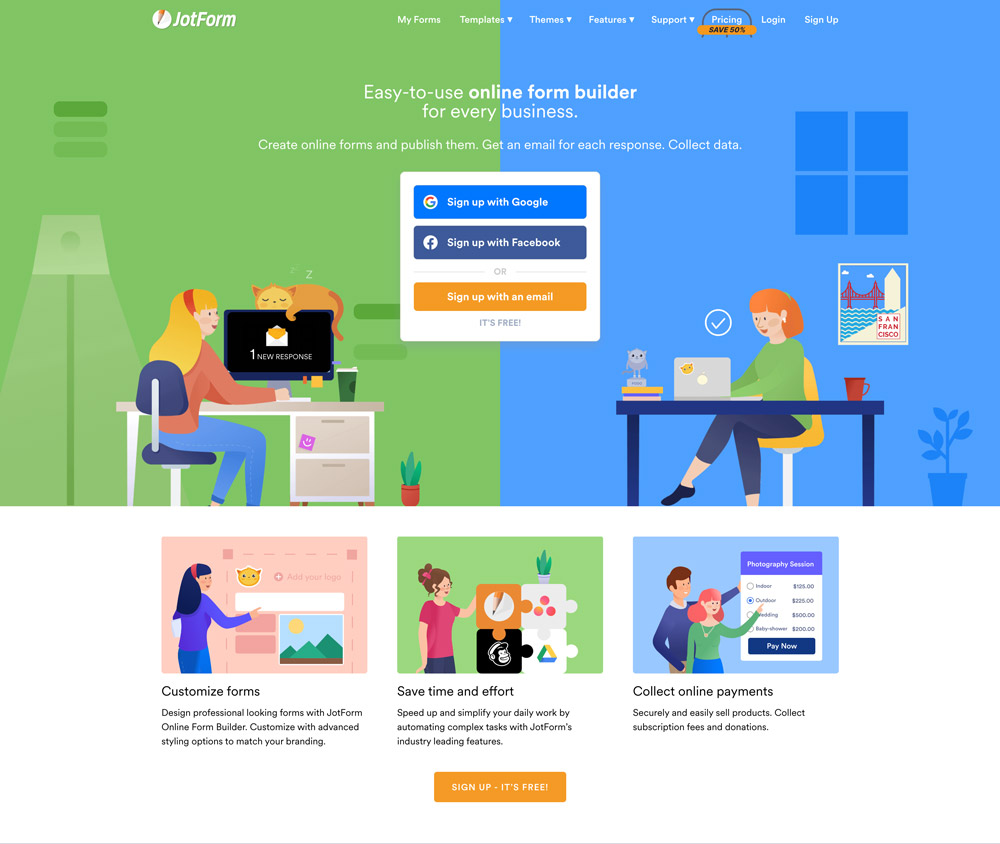
Jotform is an online form builder. Their website is colorful and very effective. The frontpage has minimal content, which contributes to its effectiveness.
12. Toggl
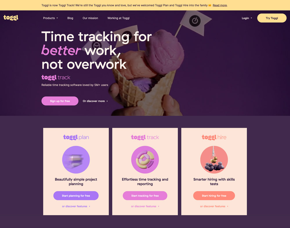
Toggl is a time tracking tool. This is another website that is properly designed. It has a light and fun feel to it, which has the power to draw anyone’s attention and probably get them to convert.
13. PandaDoc
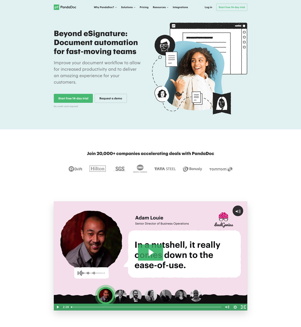
PandaDoc’s headline communicates its benefits quickly, which is very crucial to any landing page. Their services involve document automation to help improve automation.
14. Favro
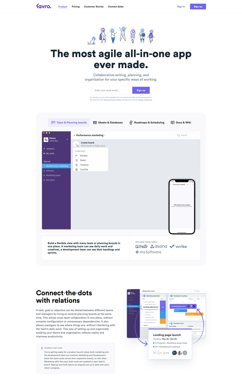
Favro did an excellent job of mentioning the benefits of their products in the headline. Although they have long web copies, the white spaces work in their favor, so reading through won’t be entirely complicated.
15. Shopify

The famous Shopify is on this list because they did well in giving their audience enough information on the home page.
Receive resources directly to your inbox
Sign up to get weekly insights & inspiration in your inbox.


